Main Product
Ancillary Texts


Promotional Poster (Advert)
I
created my poster before I produced my digipack for my two chosen ancillary
texts. First of all I decided out of all the images that I had taken which
picture I wanted to use for my advert. I felt that the image below looked the
most effective for my promotional poster because it linked with video footage I
created for my music video in the same location and costume constructing the
same poses for an image as I did for a video. I decided to call my album
'Mirror Image' this gave me the idea to duplicate my chosen image ten times
relating to the name of my album and reflecting the pop genre. I edited the
image to make it black and white linking to my music video as the majority of
that is in black and white. After some audience feedback I then realized that i
should add some colour to my poster to bring it to life with effects and link
in with the pop genre. I tried different shades of purple added to the black
and white grey scale using a gradient for my advert from top to bottom so that
the images in the background could still be seen. I then began experimenting
with different fonts and text sizes for my poster. I also had to decide whether
to use the real name of my character or make up a different performance name. I
tried to establish the most effective font style that reflects the pop genre as
well as relating to the personality of the artist. I didn't want my poster to
look too clustered with writing drowning out the images in the background but
focus more on the main elements of the advert to catch the attention of the
audience and make it memorable. I stuck to conventions of promotional album
posters from my research and included the name of the artist on the ancillary
product. I also included some extra features on my poster such as advertising
the song that I used for my advanced portfolio music video and the website name
promoting my artist. Sticking to conventions means that it creates realism for
the best impact on the audience as possible which is what is intended. I set
about creating some sort of website information for the audience to be able to
purchase the album. I added the artist’s personal website onto the promotional
poster to create links and places for the audience to visit. Overall I wanted
to make sure the most important thing was that my promotional poster and music
video linked together in the form of the ideology I was trying to create as
well as the pop genre of my music video.

Editing Process:

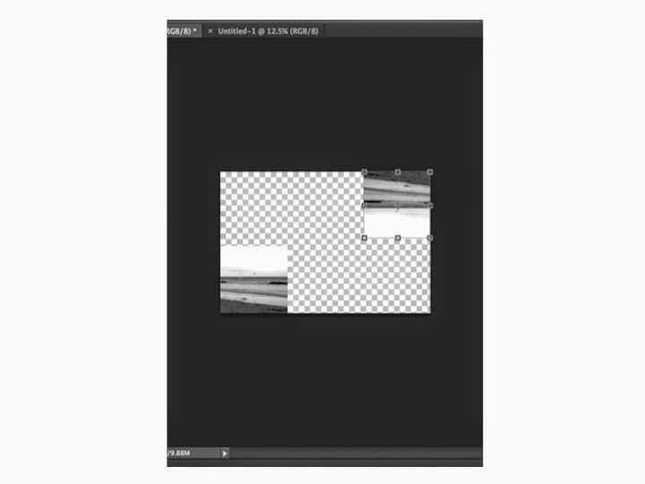
This
was the first stage in creating my poster as I got the original image and
copied it ten times then added the black and white grey scale effect to create
my background.

This
was the second stage in creating my poster as I added the purple gradient effect
over the top of my ten background images from top been the darkest to bottom
been the lightest.

This
was the third stage in creating my poster as I added four white boarders around
the edge of my advert creating guidelines as well as adding the artist’s
website name which is: www.leahhaywood.com to promote the artist and advertise.

This was the fourth stage in creating my poster as I added the name of the artist which is: Leah Haywood on top of the background images and gradient showing the audience who the advert is about.

This was the
fifth stage in creating my poster as I then added in white font the phrase:
Debut Album and the name of the album which is: Mirror Image to show the main
features of the advert in different text formats and colours making them stand
out.

This
was the sixth stage in creating my poster as I added the final bits of text
which are connecting to my music video because it promotes the single that I
have used as the soundtrack to create a music video and is bold
and prominent to the audience.
Digipack (CD)
To
create my digipack I decided to use images that I had taken whilst filming just
like I did for my promotional poster making location and costume exactly the
same. I also took some snap shots from my music video that looked attractive
and that I thought would look just as appealing as still images as well as
video footage. I experimented with many different images but finally decided to
use the images below for my digipack. I got a digipack template from the
internet and copy and pasted it into Adobe Photoshop so that I could use it for
my final product to make it look exactly like a real digipack. I created each
of the six parts of the digipack separately and then when they were finally
finished I dragged and dropped them onto my template creating the product. For
the front cover case of my digipack I used the same image as I did for my
promotional poster I did this to create recognizable products relating them
together as well as linking them to the music video. I made all of the images
for my digipack black and white using the grey scale just like I did for my
music video and advert. For the back case of my digipack I used another image
of my artist developing the personality and entire feeling that I wanted to
portray reflecting the pop genre. For my CD and DVD I used two different image
son top of each other one for the actual discs and another for inside the cases
when the discs aren't inside the digipack. I used two outside locations for
this to create a calm and peaceful effect using trees on the CD and DVD cover
and a blazing fire for the background. For the two inside covers I used the
same image reflecting the name of my album again linking back to my artist. The
image I chose to use is a picture I took whilst at the beach with my character
filming footage for my music video. I really liked the image of the beach and
think it sets the scene for my music video because the majority of my footage
is filmed at a water location including the beach linking all of my three products
together. The images that I used for my digipack all reflect the narrative of
my music video as well as my characters personality because of the locations
and costume.


Editing Process:
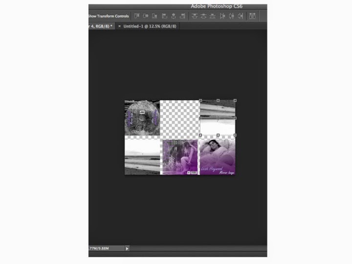
The
stages that can be seen below from one to six are
the production processes in the coming together of my digipack. I
created each individual part of my digipack on a separate Photoshop file then
eventually when they were all finished I opened a new Photoshop file and made a
digipack template. I then dragged each one of my six parts of my CD and DVD
onto the digipack file and positioned them as follows. Finally I added the
finishing touches when each of my squares were in place which were: creating
the spines of the digipack, flipping the three top images around to make them
like a real existing product and adding text to the spines to make it look
realistic and professional. When it was all complete I printed off the file and
checked that it was correct after folding the piece of paper and making it like
a real CD and DVD digipack allowing it to fold in and out.


No comments:
Post a Comment