A2 Media
Friday, 2 May 2014
Monday, 7 April 2014
In what ways does your media product use, develop or challenge forms and conventions of real media products?
My Music Video Forms And Conventions


You're everything I thought you never were
And nothing like I thought you could have been
But still you live inside of me,
So tell me how is that?
You're the only one I wish I could forget
The only one I love to not forgive
And though you break my heart,
You're the only one
And though there are times when I hate you
'Cause I can't erase
The times that you hurt me and put tears on my face
And even now, while I hate you,
It pains me to say
I know I'll be there at the end of the day
I don't wanna be without you, babe
I don't want a broken heart
Don't wanna take a breath without you, babe
I don't wanna play that part
I know that I love you, but let me just say
I don't wanna love you in no kind of way, no no
I don't want a broken heart
I don't wanna play the broken-hearted girl
No, no, no broken-hearted girl
I'm no broken-hearted girl
There's something that I feel I need to say
But up til' now I've always been afraid
That you would never come around
And still I wanna put this out
You say you've got the most respect for me
But, sometimes I feel you're not deserving of me
And still, you're in my heart
But you're the only one
And yes, there are times when I hate you,
But I don't complain
'Cause I've been afraid that you would walk away
Oh, but now I don't hate you
I'm happy to say
That I will be there at the end of the day
I don't wanna be without you, babe
I don't want a broken heart
Don't wanna take a breath without you, babe
I don't wanna play that part
I know that I love you, but let me just say
I don't wanna love you in no kind of way, no no
I don't want a broken heart
I don't wanna play the broken-hearted girl
No, no, no broken-hearted girl
Now I'm at a place I thought I'd never be, ooh
I'm living in a world that's all about you and me, yeah
Ain't gotta be afraid, my broken heart is free
To spread my wings and fly away, away with you..., yeah, yeah, yeah
I don't wanna be without my baby
I don't want a broken heart
Don't wanna take a breath without my baby
I don't wanna play that part
I know that I love you, but let me just say
I don't wanna love you in no kind of way, no no
I don't want a broken heart
I don't wanna play the broken-hearted girl
No, no, no broken-hearted girl
Broken-hearted girl
No, no, no broken-hearted girl
No broken-hearted girl
How effective is the combination of your main product and ancillary texts?
Main Product
Ancillary Texts
Promotional Poster (Advert)
I
created my poster before I produced my digipack for my two chosen ancillary
texts. First of all I decided out of all the images that I had taken which
picture I wanted to use for my advert. I felt that the image below looked the
most effective for my promotional poster because it linked with video footage I
created for my music video in the same location and costume constructing the
same poses for an image as I did for a video. I decided to call my album
'Mirror Image' this gave me the idea to duplicate my chosen image ten times
relating to the name of my album and reflecting the pop genre. I edited the
image to make it black and white linking to my music video as the majority of
that is in black and white. After some audience feedback I then realized that i
should add some colour to my poster to bring it to life with effects and link
in with the pop genre. I tried different shades of purple added to the black
and white grey scale using a gradient for my advert from top to bottom so that
the images in the background could still be seen. I then began experimenting
with different fonts and text sizes for my poster. I also had to decide whether
to use the real name of my character or make up a different performance name. I
tried to establish the most effective font style that reflects the pop genre as
well as relating to the personality of the artist. I didn't want my poster to
look too clustered with writing drowning out the images in the background but
focus more on the main elements of the advert to catch the attention of the
audience and make it memorable. I stuck to conventions of promotional album
posters from my research and included the name of the artist on the ancillary
product. I also included some extra features on my poster such as advertising
the song that I used for my advanced portfolio music video and the website name
promoting my artist. Sticking to conventions means that it creates realism for
the best impact on the audience as possible which is what is intended. I set
about creating some sort of website information for the audience to be able to
purchase the album. I added the artist’s personal website onto the promotional
poster to create links and places for the audience to visit. Overall I wanted
to make sure the most important thing was that my promotional poster and music
video linked together in the form of the ideology I was trying to create as
well as the pop genre of my music video.
This
was the first stage in creating my poster as I got the original image and
copied it ten times then added the black and white grey scale effect to create
my background.
This
was the second stage in creating my poster as I added the purple gradient effect
over the top of my ten background images from top been the darkest to bottom
been the lightest.
This
was the third stage in creating my poster as I added four white boarders around
the edge of my advert creating guidelines as well as adding the artist’s
website name which is: www.leahhaywood.com to promote the artist and advertise.
This was the fourth stage in creating my poster as I added the name of the artist which is: Leah Haywood on top of the background images and gradient showing the audience who the advert is about.
This was the
fifth stage in creating my poster as I then added in white font the phrase:
Debut Album and the name of the album which is: Mirror Image to show the main
features of the advert in different text formats and colours making them stand
out.
This
was the sixth stage in creating my poster as I added the final bits of text
which are connecting to my music video because it promotes the single that I
have used as the soundtrack to create a music video and is bold
and prominent to the audience.
Digipack (CD)
To
create my digipack I decided to use images that I had taken whilst filming just
like I did for my promotional poster making location and costume exactly the
same. I also took some snap shots from my music video that looked attractive
and that I thought would look just as appealing as still images as well as
video footage. I experimented with many different images but finally decided to
use the images below for my digipack. I got a digipack template from the
internet and copy and pasted it into Adobe Photoshop so that I could use it for
my final product to make it look exactly like a real digipack. I created each
of the six parts of the digipack separately and then when they were finally
finished I dragged and dropped them onto my template creating the product. For
the front cover case of my digipack I used the same image as I did for my
promotional poster I did this to create recognizable products relating them
together as well as linking them to the music video. I made all of the images
for my digipack black and white using the grey scale just like I did for my
music video and advert. For the back case of my digipack I used another image
of my artist developing the personality and entire feeling that I wanted to
portray reflecting the pop genre. For my CD and DVD I used two different image
son top of each other one for the actual discs and another for inside the cases
when the discs aren't inside the digipack. I used two outside locations for
this to create a calm and peaceful effect using trees on the CD and DVD cover
and a blazing fire for the background. For the two inside covers I used the
same image reflecting the name of my album again linking back to my artist. The
image I chose to use is a picture I took whilst at the beach with my character
filming footage for my music video. I really liked the image of the beach and
think it sets the scene for my music video because the majority of my footage
is filmed at a water location including the beach linking all of my three products
together. The images that I used for my digipack all reflect the narrative of
my music video as well as my characters personality because of the locations
and costume.


Editing Process:
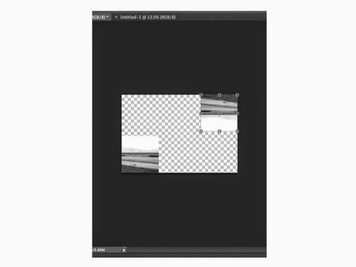
The
stages that can be seen below from one to six are
the production processes in the coming together of my digipack. I
created each individual part of my digipack on a separate Photoshop file then
eventually when they were all finished I opened a new Photoshop file and made a
digipack template. I then dragged each one of my six parts of my CD and DVD
onto the digipack file and positioned them as follows. Finally I added the
finishing touches when each of my squares were in place which were: creating
the spines of the digipack, flipping the three top images around to make them
like a real existing product and adding text to the spines to make it look
realistic and professional. When it was all complete I printed off the file and
checked that it was correct after folding the piece of paper and making it like
a real CD and DVD digipack allowing it to fold in and out.
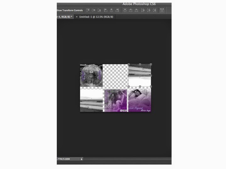
What have you learned from your audience feedback?
Main Product (Music Video) Feedback
Audience Feedback Questionnaire (Family)
1. Are you male or female?
2. Do you
understand the pop genre of my music video?
3. Do you
understand the narrative of my music video?
4. What is your favourite
part of my music video?
5. What is your
least favourite part of my music video?
6. What
improvements do you think I should make?
The questions
above are the six different questions that I asked my peers for audience
feedback. Firstly I used my family at home. I did this so that I could receive
a range of different feedback from different sexes and age groups of people
from outside of the college environment.
Family Audience Feedback
Question One
For my family audience feedback I asked five males and five females to
gain opinions from both genders of different ages within my family.
Question Two
All five males and females said that they understood that my music video
genre is pop. This suggests that I have successfully followed the codes and
conventions of the pop music genre for it to be recognizable to an audience.
Question Three
Three people out of ten said that they did not understand the narrative
of my music video. Therefore seven out of ten said that they understood the
narrative of my music video. All three of the people that said they didn't
understand the narrative of my music video were males from the findings that I
gathered together.
Question Four
For question four my family gave a range of different feedback about
their favourite parts of my music video none of the answers were the
same as each other some were similar but slightly different. Below is a list of
the positive things that my audience said about my music video:
- The different video footage
of waves at the beginning
- The mainly black and white colour
scheme
- Picking the roses apart and
putting them back together
- The garden swing footage
- The footage of different
types of water (the beach, the lakes and the ponds)
- Two videos merged together
with added effects
- The fade and dissolve
transitions from one part to the next
- All of the beach location footage
- The slowed down ending as
the video finishes
- The reversing of waves on
the beach
Question Five
- The video footage of the
garden
- The green looking colour
videos
- The colour footage that
isn't in black and white
- The ending of the music
video
- The footage that is in colour
- The garden swing scenes
- The green video parts
- The black and white theme
throughout
- The repetitiveness of waves
- The plain colour video
sections
The main area of concern that i can see clearly from this audience
feedback is the colour video footage that has a slightly green tint on two of
the video scenes because it was filmed with a green screen and had effects
added to it. It is difficult to remove the whole green effect around the
outline of the artist because of the lighting and green screen in the
background. Other areas of improve that are highlighted within the feedback is
the footage of waves been fairly repetitive throughout the music video and the
scenes that I filmed in a garden.
Question Six
Question Six
Audience Feedback Questionnaire (Friends)
1. What is your favourite part of my music video?
2. What is your least favourite part of my music video?
3. What do you think I could improve on?
4. What do you think I should keep the same?
5. Do you understand the narrative of my music video?
6. Do you understand the genre of my music video?
The questions above are the six different questions that I asked my
peers for audience feedback. Secondly I used my friends at college. I did this
so that I could receive a range of different feedback from different sexes and
age groups of people from inside of the college environment. Below is a picture
of the Questionnaire that i handed out to my audience for feedback.
Question Six
Overall
I think that my music video was successful and effective and my audience
feedback reflects this. I received the majority of positive and also some
negative feedback which I acted on throughout my advanced portfolio project.
When I asked my peers at college if they understood the narrative and genre of
my music video I received the answer 'yes' as the majority answer and 'no' as
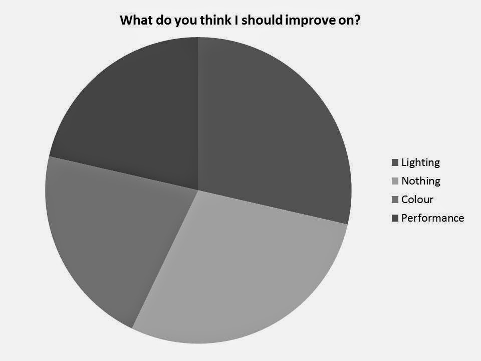
the minority answer. People thought that my main improvements could be: the
lighting whilst filming, the colour parts of my music video and the lack of
performance video footage. Some people even said that I didn't need to improve
on anything at all in my music video. After feedback I changed certain parts of
my music video for example I took out some of the colour green screen parts
that after adding the editing effects the green screen colour was still visible
in the background and also I completely removed parts when the lighting wasn't
very good when I was filming.
Ancillary Texts (Advert/Digipack) Feedback
I asked four different questions to my audience which were:
1. Do you think my
promotional poster fulfils its purpose?
2. Do you think that my
digipack is effective?
3. What do you think I
could improve on?
4. What do you think I
should keep the same?
Overall
I think that my ancillary texts were also successful and effective and my
audience feedback reflects this. My ancillary texts didn't take up as much time
to produce as my music video but I produced more drafts of my promotional
poster and digipack than I did my music video because of the technological
difference between the programs that I used for each stage. When I asked my
audience if they thought my promotional poster fulfils its purpose and if they
thought my digipack was effective they all answered with 'yes'. The main
improvements that my audience thought I should make were to my digipack and not
my promotional poster. These improvements were:
- Add more life to the inside
of the digipack.
- Make the inside of my
digipack less plain and boring.
- Take away duplicated images
from inside the digipack.
- Use more images of the
artist inside the digipack.
The two Go Animate productions that I have created below are from two
male audience feedback interviews of peers in my college environment that would
happily answer my questionnaire but didn't want to be filmed on camera.
How did you use media technologies in the construction and research, planning and evaluation stages?
YouTube
is a video sharing website available to everybody worldwide so that users can
upload, watch and share videos with others. The website includes: video clips,
TV clips and music videos. It also contains content such as blogging videos
which is what I have created a YouTube account and used it for. YouTube is a
necessity to upload video footage to blogger which I used for both my AS and A2
media coursework. I have used YouTube for a very long time not only within
college but also outside of college since a young age therefore I am positive
about how to use the program and understand all of the features and content. I
used YouTube to copy and paste the web addresses of certain music videos that I
wanted to include on my blog that were posted on YouTube mainly by the VEVO
program. I also used it for making my own personal account and adding videos to
my account that I could chose to be either private or public to share with my
audience. I uploaded videos of audience feedback from my peers so that at a
later date I could upload them into my blogger account via YouTube. I added my
finished music video to YouTube for feedback and so that it is easily
accessible ad available for people to view whenever they want without them
having to find my blogger address first.
Blogger
is a program owned by Google that is a blog publishing service. Blogs can be
seen by audiences worldwide as long as a person’s blogger profile is set to
public and not private. I used blogger at every stage of my advanced portfolio
media coursework. I have published everything that I have produced myself as
well as existing information and products to my blogger account. I have
included huge amounts on my blog about the construction stages whist making my
music video. I have also included all of my planning and research on my blog
that i produced before starting to make my own product. My entire evaluation is
published on my blog for it to be seen easily by anybody in the world with my
blog address. Blogger is a very easy and accessible as well as useful and
effective way of designing and posting my coursework too. It allows you to
include video footage as well as existing videos from YouTube. It also lets you
add images of your own and from Google and other websites. When a post is
published a date and time is shown on the post which can be changed at a later
date to order all of your work. I changed the dates of some of my posts that
weren't in the right order to ensure everything was on my blog in the correct
place. Blog posts have large titles that can be seen to make sure that
information and posts can easily be accessed and found by everybody. I used
blogger in my AS and A2 coursework projects therefore I now have a lot of
experience about the software and what you can and can't do on Blogger.
Subscribe to:
Comments (Atom)


